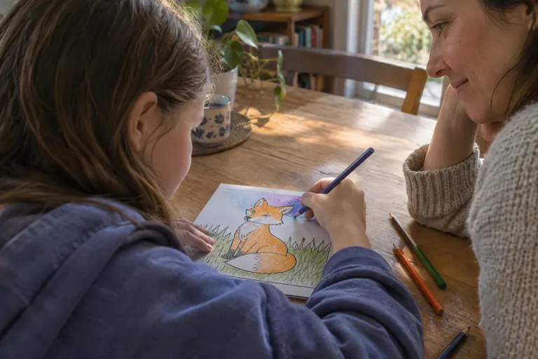
Your eleven-year-old finished the fox page an hour ago. Orange fox, green grass, brown leaves, every gap filled, and still they push it across the desk and say it looks flat. The coloring is fine. What the page is missing is one color they have not put down yet, and it sits straight across the color wheel from the fox.
Around nine to twelve, this idea finally lands. Younger kids can recite "red and green are opposites" without it changing anything they do. Tweens start planning a page before they color it, which is the stage coloring for tweens describes, and complementary colors are the first planning tool that visibly works.
Opposites on the wheel, and a test that proves them
Complementary colors are the pairs that sit across from each other on the color wheel. The National Gallery describes them as colors with maximum contrast for each other, and names the three core pairs painters work with: red and green, yellow and violet, blue and orange. If the wheel itself is still new, start with the color wheel as a mixing map and come back.
A rule sticks better when a tween can check it with their own eyes. This one takes about a minute and comes from the Exploratorium's bird in a cage exhibit:
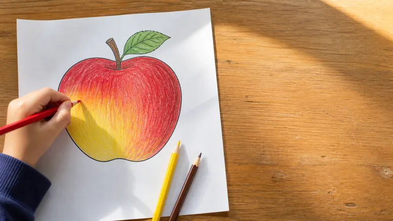
- 1Color a solid red circle, about the size of a coin, in the middle of a white sheet.
- 2Stare at a dot in its center for thirty seconds without looking away.
- 3Look at a blank white sheet and wait a moment.
A blue-green ghost of the circle floats on the white paper. The red-sensitive cells in the eye adapt while you stare and lose some of their sensitivity, so for a few seconds white looks like white minus red. Do it again with a green circle and the ghost turns magenta. The eye pairs every color with its opposite all on its own, and that is why the rest of this works.
Why an orange fox looks brighter next to blue
In 1824 the chemist Michel Eugène Chevreul took over the dye works at the Gobelins tapestry workshop in Paris, partly to deal with complaints that the dyed wool came out inconsistent. Much of the trouble, he found, was in the eye: the same yarn looks different depending on the colors woven around it. He called it simultaneous contrast and published his book on it in 1839, a book some Impressionist painters went on to read (Linda Hall Library).
The short version of his rule: a color seems to shift toward the complement of its neighbor. Next to blue, orange is pushed toward the complement of blue, which is orange again. So each color in a complementary pair makes the other look more like itself.
| Pair | Side by side | Where a tween has already seen it |
|---|---|---|
| Red and green | The red reads hotter and the green fresher | A ladybug on a leaf, holly berries |
| Yellow and violet | The yellow seems to glow | A crocus with its yellow center, a sunflower against a dusk sky |
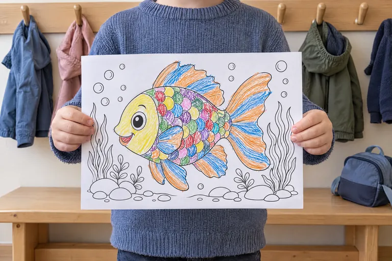
| Blue and orange | The orange jumps forward | A goldfish in a blue bowl, a tiger on snow in shadow |
Blue and orange are also a cool and a warm color, so that pair gets the push from both directions, as warm colors come forward, cool colors step back explains.
Three jobs one pair can do on a page
Pop. Color the subject in one color and a small patch right behind it in the opposite. A band of sky behind a head, the ground just under the paws. Keep the patch small, so the subject stays the loudest thing on the page.
Shadow. The National Gallery notes that painters tinted shadows with the complement of the nearby highlight, and that the Impressionists leaned on it heavily. On a coloring page: shade the orange fox with a light layer of blue where the shadow falls. Mixed together, complements move toward grey, so the layered spot reads as a deeper, quieter orange. The pressure and layering are the same as in shading with colored pencils.
Accent. Leave a big page mostly in one color family and put one small thing in its opposite. A green meadow with one red kite. The eye goes there first, every time.



Coloring fun for kids — anywhere.
Free for iOS & Android. No ads, no sign-up, offline-ready.


Coloring fun for kids — anywhere.
Free coloring app for kids. iOS and Android, phones and tablets. No ads, no sign-up, even offline.
When the pair starts to fight
Two complements at full strength, in equal amounts, edge to edge, tend to make a page loud everywhere. Nothing stands out because everything does. Tweens who have just discovered the trick often do exactly this, and it is a good mistake to make once.
Three fixes, in the order to try them:
- Let one color win. Roughly three parts of one to one part of the other.
- Quiet one color with a light layer of its own opposite.
- Leave a thin line of white paper, or a dark line, between the two.
One page for each pair
These three pages each carry one pair already. The ladybugs on a curled leaf ask for red bugs and the green across from them. The sunflower seen from below wants yellow petals against a soft violet sky. The tiger in the snow gets its orange coat, then pale blue only in the snow where its shadow falls.

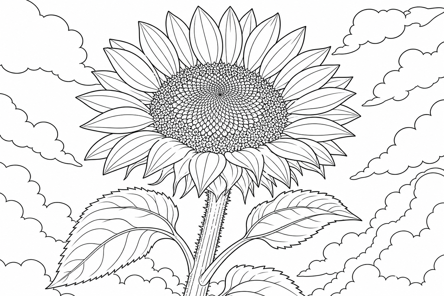
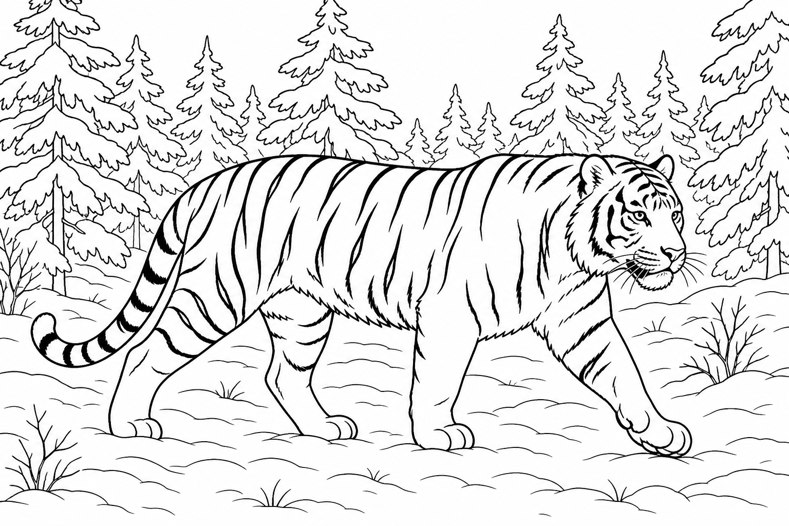
Any page with one clear subject works the same way. These searches turn up good ones:
What else could you color?
Pick a prompt or type your own — opens in a new tab.
Next time, change one thing
Back at the desk, the fox page needed two small things: a strip of blue violet dusk behind the ears and a little blue in the shadow under the tail. On the next page, let your tween color the way they always do and change one thing only: one patch of background in the opposite of the subject. Then hang the two pages side by side and ask which one they would rather look at.